
My Changes:
Since I was happy with the way the La Primavera MousterWork turned out, I thought The Dancing Class would be a great companion illustration. So I recycled most of those characters, added in a couple extra colors where Degas used black (partly to create more continuity between both illustrations), and spiced up the violinist’s jacket.
Things I thought/Questions I asked:
Those who’ve been following me know I adore ballet, and Degas’s painting brings back so many memories. I don’t know what time of year this painting takes place, but it takes me back to summertime classes in a room with large windows, pointe shoes, lots of sweat, friendships, and wonderful music. We never had a live violinist, but that would have been fun! I wonder, did he like the job? Did he interact with the dancers? I want to know if these dancers loved dancing like I did, if they were friends, or if there was a lot of unspoken competition. I’m curious about why the girl to the far right is facing the wall. And Degas’s dancers are always wearing tutus. Did they always dress up for dance class, or did he capture them during dress rehearsals?
What I noticed or learned from Degas’s techniques:
I love Degas’s use of texture and tried to incorporate it in my MousterWork. I also appreciate how he combines realism with his personal interpretation that doesn’t have perfectly clear lines. I’m also a fan of how Degas captures a non-scripted moment. Each movement and pose jumpstarts a story about each person while also making me want to know more. I could easily make lots of stories about this dance class!
If you’d like to own a print of this MousterWork, I’ve added it to my Etsy shop.

My Changes:
Most of the recent characters in this series have been Caucasian, so I opted to change the race this time. Since Emilie’s hair is curly, I thought African American would be a fun fit—especially if I made her hair really long. I also thought it would be fun to turn Emilie into an older sister, and to alter their glances to make it a little more than a portrait.
Things I thought/Questions I asked:
Although this precedes the Victorian era, it’s plain that it’s a precursor—and I’m such a fan of the clothes at this time. I also love long walks and flowers, so the fact that Emilie and her son have both been on a walk together collecting wildflowers creates a generational link. Was this something they did often? What else did they do together? Emily looks friendly, though maybe a little shy? Would we be friends? I like to think we would.
What I noticed or learned from David’s techniques:
Not many artists are willing to use pure white, so I’m awed that David boldly juxtaposes Emilie’s arm with his almost black background. That sense of light is lovely and ensures that we look exactly where he wants us to—and it pushed me to push my values darker than I often do (though finding the right balance was made harder after giving her longer hair . . .). I also admire how well David captured her in the moment: it feels like Emilie just sat down after returning home from her wonderful excursion.

My Changes:
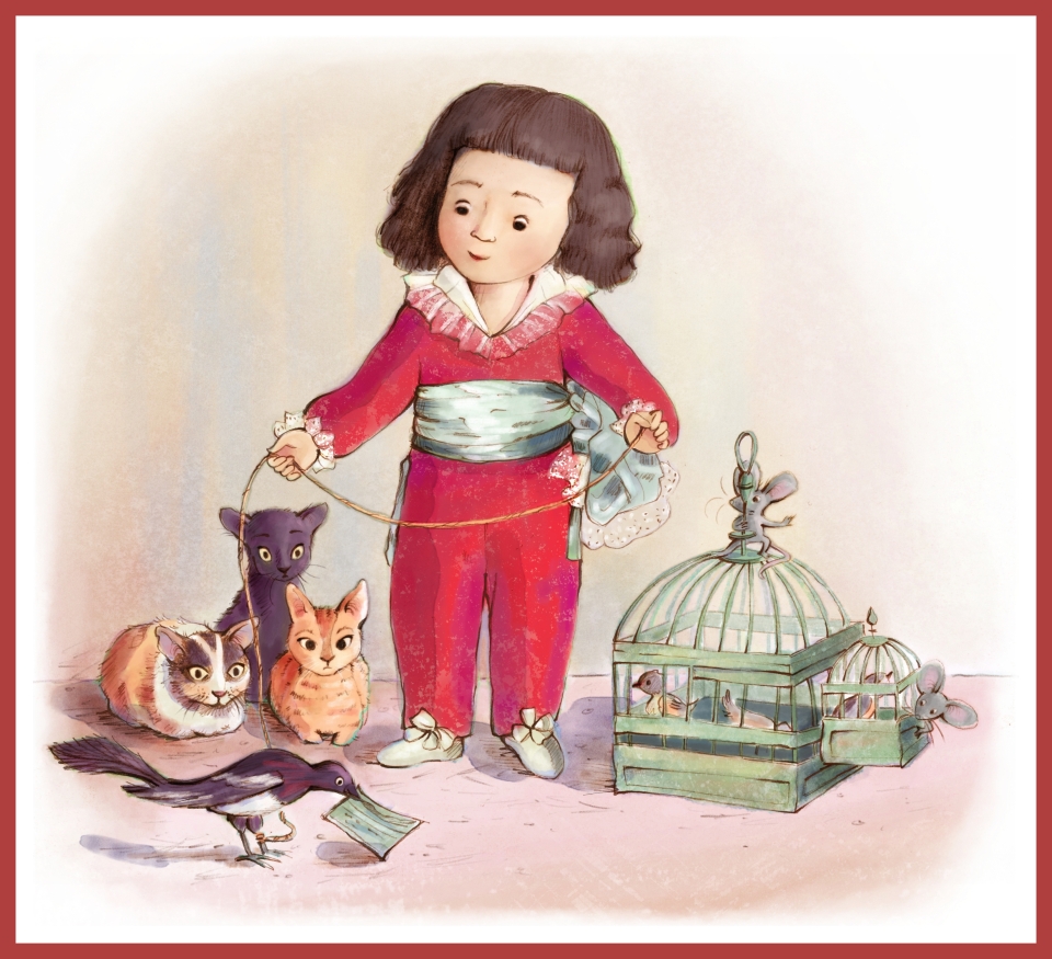
Since so many of MousterWorks have been full-bleed, I wanted a little variety and made this one a vignette. I also wanted the little boy interacting with the magpie, so I turned his glance downward. Last of all, I opted for a lighter, less dramatic background so you can more clearly be privy to the drama and humor so carefully set up in the piece.
Things I thought/Questions I asked:
This was another favorite painting from my childhood. I don’t think I much noticed the animals—for me it was all about the boy. (I guess my magpie would have found itself in as much peril!) Who is he, and what is it about him that commands our attention? Is it the brilliant red costume, gleaming sash, china-doll skin, or his expression that casts the spell? What is he thinking about? There’s something in the original that makes him look lonely, detached, bored, and innocent (though perhaps not for long!).
Today, I adore Goya’s storytelling. The juxtaposition between the boy’s other-worldly, almost doll-like demeanor and the practically human, intense focus of those cats is the most interesting aspect of this painting.
What I noticed or learned from Goya’s techniques:
Goya has perfect control over color, value, and anatomy, but what I think he does best is how he tricks us (mesmerizes us?) to focus on Manuel before we recognize the danger lurking in the shadows.
Of course, I ignored that technique and turned on the lights . . .

When I was little, Mom and I often looked through a beautiful book of Masterpieces. I asked lots of questions about these people painted in time: How were we the same? How were we different? If you are also a fan of masterpieces, children’s book art, and searching for mice, I invite you to follow along!
All original images © Angela C. Hawkins


Love a MousterWork print? They will be available in my Etsy shop. Don’t see the one you want? Email me and I’ll add it in.