
My Changes:
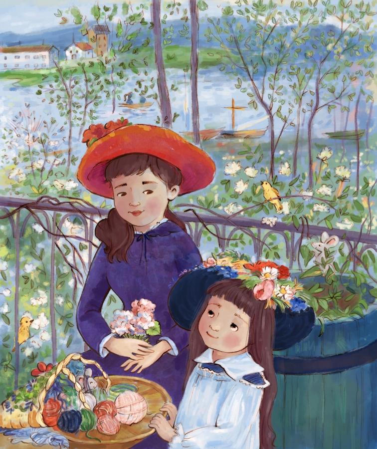
I wanted the sisters to feel like they are interacting at least a little bit, so I made them look at each other. I also changed their nationalities, simplified the foliage (there’s a lot going on!), and added in a couple yellow creatures (can you find them?).
Things I thought/Questions I asked:
Where is this place—because can I go there? It looks so peaceful and reminds me when my boys were little and our family visited the zoo or botanic gardens at the end of the day. I hear the water lapping at the shoreline, the pull of oars through the lake, and distant conversations. There are probably songbirds, perhaps a few buzzing bees, and a gentle breeze to carry the flowers’ lovely scent. Is it spring or the end of summer? Do these sisters visit here often? And what are they doing? They must be making something with that array of yarn, but what? Also, the younger sister’s hat would be so much fun to wear!
What I noticed or learned from Renoir’s techniques:
I was overwhelmed by the thought of painting all the foliage in this piece, but it looked like Renoir worked in layers starting at the bottom and working up to the top. As I tackled each section this way, it felt manageable. Like many of the other paintings I’ve done this month, impressionistic elements really add movement and aliveness to each illustration. Still, with so much going on and a lot of color to work with, it really could have felt like too much. Renoir’s choice to make the older sister the largest and darkest part of the masterpiece really helps tie it together and provide focus.
My Changes:
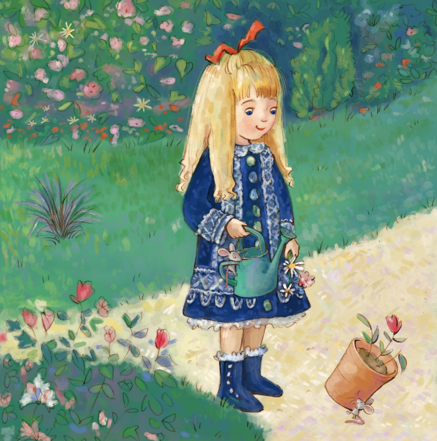
Simplified the lace, grew her hair, and played around with the range of colors and value structure. And if you follow me on Instagram, you’ll know I tried adding in various favorite children’s book characters before opting for this iteration (as suggested by one of my wonderful critique groups).
Things I thought/Questions I asked:
This was another favorite masterpiece from my childhood. I remember asking my mom who this girl was—and feeling disappointed that there were no answers. Given the fact that she likes pretty dresses and flowers, I was certain we would have been friends! Today I wonder how often she came to this garden. Was she quiet or loud? (I think she was quiet.) Did she play alone or with a friend? She seems so happy and content.
By the way, I realized that this was painted 100 years before I was born. It is also another painting of Monet’s magical garden!
Also, if you’re growing weary of all these gardens, I apologize—when I was planned my MousterWork schedule last December, I didn’t realize how many garden pieces I planned for August!
What I noticed or learned from Renoir’s techniques:
While doing some research, I learned that Renoir used no shadows in this painting. He didn’t use black either, reasoning that there is no real black in nature. If you look closely, you’ll notice he used variations of color to give it some depth and form, but there aren’t many sharp or abrupt changes. Renoir’s intention was to replicate how things look when illuminated by sunlight. I love how Renoir did the grass and dirt, especially how he uses that lavender. I may incorporate some of these elements in my own work!
Like with Monet, Renoir’s strokes of color really help the painting come alive. I think they also provide added focus to her facial features, which really demand your attention since they are more focused and are painted in brilliant blues and reds.
My Changes:
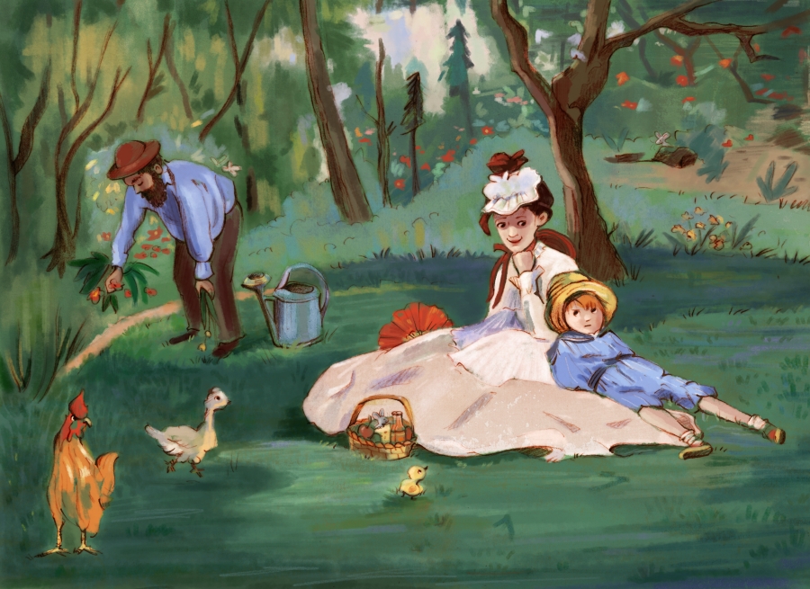
Added in a little more clarity and changed the boy’s expression.
Things I thought/Questions I asked:
My first sketch was derived from a grayscale image of this piece and I was a little shocked to consider what Monet was holding. With the rooster and hen standing nearby, I feared that perhaps he was decapitating another rooster! I was relieved, upon closer examination in color, to find that he’s just pulling weeds or flowers from the garden. (Whew!) There were a couple other things I missed in the grayscale—particularly the chick, some of the background flowers, and the fan. My favorite part of this masterpiece, however, is the boy’s expression. Is he unhappy or just exhausted? I think that he might be upset with his mom for some reason—maybe she made him work hard in the garden and now they’re taking a break? Or maybe he’s unhappy with the chickens? Except, how could you be mad when a cute chick is looking up at you?
What I noticed or learned from Manet’s techniques:
It’s impressive how Manet uses broad brush strokes and splotches of paint to create a scene that makes sense—and I think it’s his mastery over value that makes this scene work so well. Since Manet’s style is so different than mine, I really needed to figure out how to incorporate aspects of his painterly style into my more realistic approach. Like last week, this masterpiece challenged me to work in a way I never have. I’m not sure I fully succeeded, but it did make me think. I really enjoyed using the shapes he found in the rooster and hen and Manet’s vibrant splotches of color in the garden foliage.
My Changes:
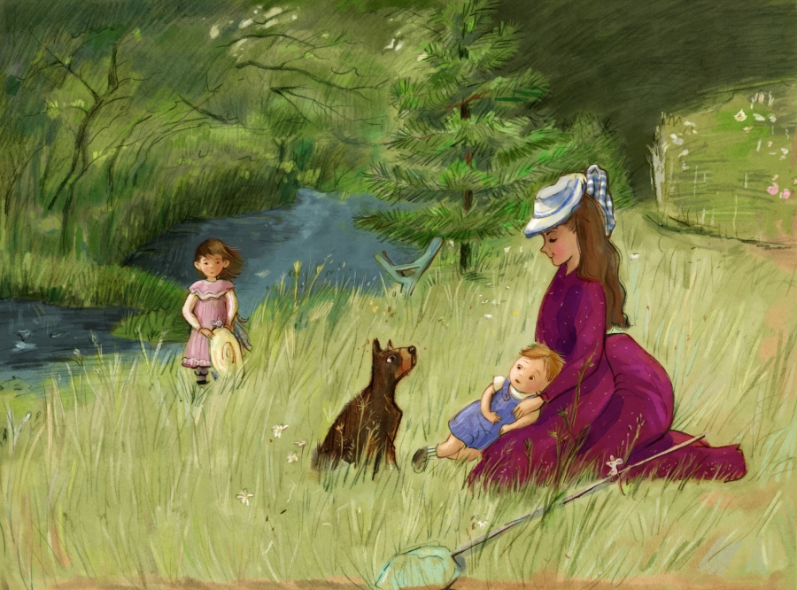
Enlarged the dog, added a little extra color to the clothing, and made the facial features more prominent.
Things I thought/Questions I asked:
Does this family visit the park often? They’ve opted to sit in the tall grasses without a blanket. Is it itchy? Do they worry about their clothes? Do they suffer from allergies? The net shows they’ve been collecting butterflies. Were they successful? Why is the girl keeping her distance? I get the feeling she might be afraid of the dog. Is this their dog or is it a stray?
What I noticed or learned from Morisot’s techniques:
This painting pushed me to try new ways of expressing what I see. I love Morisot’s expressive texture. There’s a part of me that wants to try recreating this with actual pastels to see if I can recreate that amazing texture. She wisely uses the grungy grasses and foliage lines to create movement within the composition, helping the piece feel alive. (Can you hear the bees?) Morisot’s shapes indicate she has a good understanding of anatomy, but instead of defining all the features perfectly she chose to focus on mood over realism. Her brilliant splotches of saturated color for the flowers are another excellent decision. It all works to create a timeless moment, and the non-descript details make it feel sightly mysterious. I want to visit this wonderful park!
This MousterWork was challenging since Morisot works so differently than me. I had a hard time figuring out what each element is (I’m pretty sure there’s a lake behind the daughter?), and in knowing when I was finished because I wanted to preserve the grunginess of the original while also maintaining some of my own style.

When I was little, Mom and I often looked through a beautiful book of Masterpieces. I asked lots of questions about these people painted in time: How were we the same? How were we different? If you are also a fan of masterpieces, children’s book art, and searching for mice, I invite you to follow along!
All original images © Angela C. Hawkins


Love a MousterWork print? They will be available in my Etsy shop. Don’t see the one you want? Email me and I’ll add it in.