
My Changes:
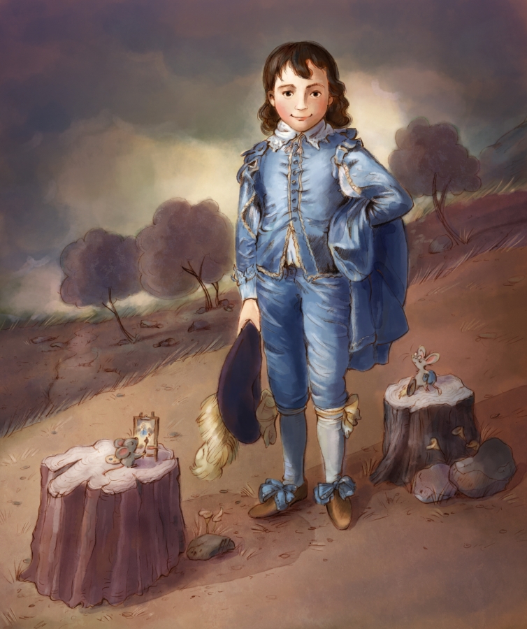
I added in some storytelling, invented a few background elements (Gainsborough keeps you guessing!), and slightly altered the background colors. I tried to stay mostly true to the original background colors once I read that one of Gainsborough’s rivals thought it was impossible for anyone to successfully paint a picture using mostly cold colors, especially in the background. This was Gainsborough’s attempt to prove him wrong.
You may also note that my boy’s face is wider and proportionately larger. It wasn’t entirely intentional, but I did want him to feel slightly younger than the original and old enough for a portrait like this.
Things I thought/Questions I asked:
First off, that outfit had to be way too sweaty and uncomfortable—especially if you had to pose in it for a long time. (Hopefully it was a cool, windy day?!) Experts think this was Jonathan Buttle, who came from a wealthy family (though not aristocratic). He looks confident, and perhaps a little arrogant? What was he really like? In the end he went bankrupt, so maybe he really was all this? Or maybe he was just unlucky!
This painting has always fascinated me. I often wonder what attracts us to one painting more than another. In this one, is it the atmospheric mood? his confidence? all that satin? As a child, I think I just admired the way Gainsborough painted fabrics so beautifully and intricately. As an adult, I like it for the boy’s expression.
What I noticed or learned from Gainsborough’s techniques:
My default is to paint light, warm backgrounds. I started doing the same here too, so I’m glad I read the quote by Gainsborough’s rival; it became a good exercise for me to try something different. My rendition still isn’t as dark as the original because I wanted a clearer look at the background elements, but it pushed me to go darker than I usually do. It was also good practice to draw all those fabric folds, to include a wide variety of colors in the boy’s face, and to use the sky as an element for adding movement and drama.

My Changes:
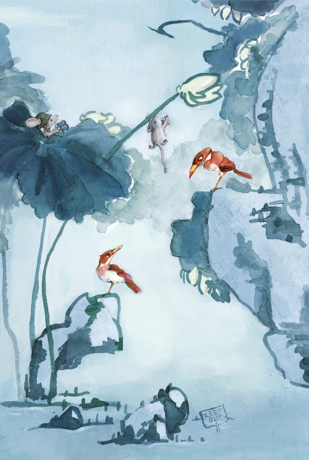
This one led me to experiment with various approaches. Like always, I completed a sketch and started painting like usual (where you can see the linework underneath). But I was intrigued to see what it would look like painting the leaves with no lines (using opaque paint), like in the original (minus opaque paint). I liked where that took me, so I added digital brushstrokes over all the lines (except for the characters). When I added in color and value (deviating from Shanren), however, I felt compelled to add in crevices and shadows that weren’t in the original. My husband pointed out that, while he liked it, my version was perhaps too far removed from the original. Other friends mentioned the over-pumped value might also be stealing center stage from the birds, and that the leaves didn’t have the dewy bleed of watercolor on rice paper. So I took a few steps back to rethink what I wanted from this exercise. In the end, I chose to toss out my pencil lines (except for the animals) and paint the lines in watercolor—which is what you see here. And although it’s true that Shanren didn’t use color, I feel like what I ended up with is close enough to be inspired by true events.
Full disclosure: It’s been forever since I painted traditionally (I was a little nervous . . .), so many of watercolors had hardened. I ended up painting the lines, leaves, and tones with my still-soft-enough maroon, which I digitally manipulated into the colors I wanted. Maybe someday I’ll pick up some fresh paints and try the whole thing traditionally!
Things I thought/Questions I asked:
After wondering what kind of birds these are, one of my critique groups guessed they are some kind of Kingfisher. I love how comical (and almost menacing) they look, which led to the inclusion of a KEEP OUT sign in their domain. They’ve got great personality, and their surroundings are so interesting. The more I look, the more intrigued I am to know their story. Are they friends? enemies? compadres? And how do they feel about two strange mice encroaching their territory?!
It was fascinating to learn that Shanren might be the first caricature artist. If you look through his collection of work, you’ll find a lot of comical birds (mostly ducks).
What I noticed or learned from Shanren’s techniques:
Painting lines is different than drawing them! I was much slower and deliberate painting them than when I use a pencil—especially as I worked to achieve the varied lines and textures of the original. I’m impressed with how much Shanren said with minimal lines and tones. A friend also pointed out the movement he invoked by using an ikebana approach with his compositional lines, as he balanced elements within the space. His painting encouraged me to think about that balance in my choices of value, saturation, and color. This painting didn’t come together as quickly as I might have wanted but I am quite happy with the outcome. I’d like to try making some kind of a companion piece sometime.

My Changes:
In the process of recreating master copies, I’ve noticed that most artists recreated biblical scenes with props from their own time—so that’s what I decided to do here. Since diversity is especially important to us today, I changed all children to represent four different minorities. Because my characters are dark instead of illuminated like in the original, I needed to change the value structure to include a light background so they would stand out. This included removing the cave, but the upper left corner felt bare, so I added a tree.
I felt that Rubens rendered the toddlers with longer limbs and torsos than in reality, so I tweaked mine to feel more childlike and dressed them in modern clothing. And because I enjoy illustrators who aren’t 100% representational with color, I challenged myself to play around in that way. (This wasn’t easy!) You’ll also notice that I changed the green grapes to red. Just because.
Unless you are familiar with Rubens’s and Snyders’s original painting, you might not recognize this as a master copy!
Things I thought/Questions I asked:
To be honest, I didn’t ask a lot of questions about what’s going on in this painting. I think the original children are super cute: I appreciate their fat folds, soft skin, curls, and cherubic faces. I enjoyed recreating each personality and childlike mannerism, which feel very on-point to me. I admit I pity that very patient sheep the left angel is lifting!
Until I started drawing, I didn’t notice the bird on the right—so finding hidden surprises was also fun.
What I noticed or learned from Ruben and Snyder’s techniques:
When I tried researching about this painting, I found nothing about it specifically, but I did learn that Rubens and Snyders collaborated quite often. Rubens always painted people while Snyders took on backgrounds and animals—which made me think I should have collaborated with someone as well! (I’ll draw children any day!) Rubens’s children are super cute, and they take center stage. I especially love the upper left angel’s eyes and expression. Snyders added depth and interest to the painting by making the fruit luscious and inviting, giving painstaking care to the grape leaves and tendrils, and rendering the sheep and bird exquisitely.
But I wish I knew the inspiration behind this masterpiece!

My Changes:
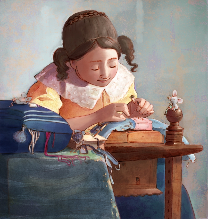
As you can see, I didn’t change much besides interpretating Vermeer’s painting into my style. I added a more watercolor-like background with small splashes of color from within the painting overall. I also opted to lighten the shadows on her face so we can see her features a little more.
Things I thought/Questions I asked:
I love how Vermeer’s lacemaker herself pays attention to detail. You see it not only in the careful focus on her project, but also in her hair— not a strand out of place (well, I added in a few loose ones, since that’s what I do!), her dress—perfectly clean and well-fitted, and her workstation—although some items are somewhat strewn, they are laid out in an orderly way. She strikes me as someone who is quiet and lovely; someone a mouse would adore and enjoy spending time with. Someone who might enjoy the company of a mouse?
I could ask the question I’ve posed for all three Vermeer paintings: Who is this girl? Where is she from? How did she get this job? Does she like it? What is she thinking right now? Is she absorbed in her work, or is something else on her mind? Has she made lace for a long time, or is she just learning? Will this project be for her own enjoyment, or is it for someone else? Does she come from a working family or a place of affluence?
My research didn’t tell me who this girl was, which makes me think Vermeer created this painting because he found beauty in something many would consider small and unimportant. It states, as quietly as the lacemaker going about her business, that a simple act of labor is something to celebrate.
Which makes me wonder what he would paint if he were alive today?
What I noticed or learned from Vermeer’s techniques:
Vermeer is masterful at his composition, every object in the painting pointing to the task at hand. He further leaves the background blank so nothing distracts us from her (the same as in Girl with a Pearl Earring.) And maybe he doesn’t want to distract her? Vermeer’s color and light also work harmoniously to give additional focus on her and her work.
I further love that Vermeer meticulously portrayed each piece of equipment. It’s also clear that he watched her long enough to know which pose perfectly expressed the moment of complete concentration.

When I was little, Mom and I often looked through a beautiful book of Masterpieces. I asked lots of questions about these people painted in time: How were we the same? How were we different? If you are also a fan of masterpieces, children’s book art, and searching for mice, I invite you to follow along!
All original images © Angela C. Hawkins


Love a MousterWork print? They will be available in my Etsy shop. Don’t see the one you want? Email me and I’ll add it in.