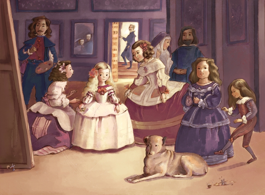
My Changes:
Changed the color palette to something a little brighter, cropped the painting, moved the boy’s foot away from the dog, added in abstract paintings to the walls, and livened up each person just a touch.
Things I thought/Questions I asked:
This was my favorite painting in the art history book my mom and I looked through (and the catalyst for this year’s Mousterworks exploration). I loved this little girl and have often thought of her. What was it like to be her? Did she have friends? Did she enjoy being a princess? Did she like that dress? (I would have given anything to wear it!)
Speaking of that dress, it has always captivated me. When I was maybe five years old, I layered all the skirts I owned so they would poof out—inspired by her dress, of course. I later fashioned my own hoop skirt out of wire coat hangers hoping to create an even larger poof.
While examining the painting this time around, I thought about what it would be like to live in that castle. It sounds romantic, but after more thought I realized they didn’t have central heat, lights, or large windows to bring in natural light (something I love). I also wondered about the boy. Was he tormenting the dog? Did he and the princess play together? fight? And I loved that—once again!—this painting shows that people have enjoyed pets for centuries!
In my research, I also found that I’m not alone in my admiration of Las Meninas! An online search pulled up quite the list of other artists with their own master copies. In fact, Picasso painted a notable series of Las Meninas versions!
What I noticed or learned from Diego Velasquez’s techniques:
I think one of the reasons this painting is so well loved is Velasquez’s masterful storytelling. By studying each expression and pose you have a strong sense of their personality, their worries, and their motivation. Velasquez also uses composition (all those nurses circled around the princess), lighting, and value structure to further amp up that storytelling. Then when you zoom in, he’s so good at describing textures for clothing and hair with just a few flicks of his brush. And even closer looks reveal intriguing Easter eggs—like the king and queen in the mirror watching everything unfold. I further admire that Velasquez painted all walks of life, not just the nobility.
If you’d like to own a print of this MousterWork, I’ve added it to my Etsy shop.
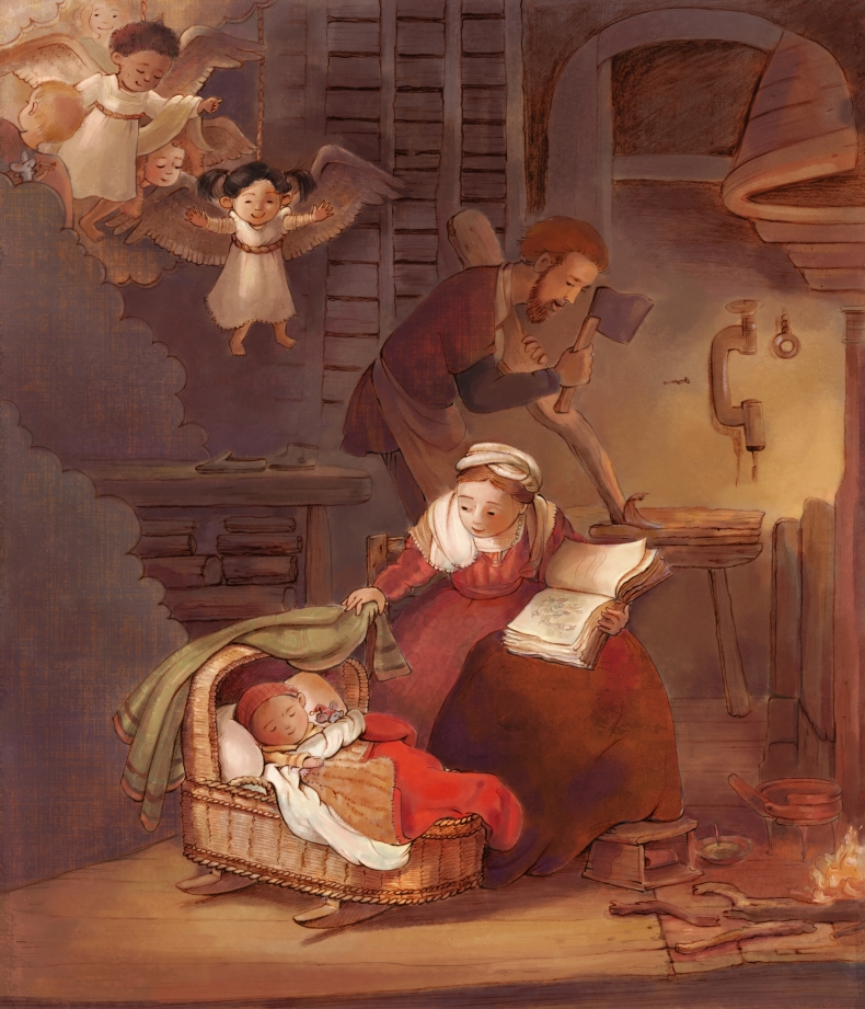
My Changes:
I thought about changing the background color to a cool blue but eventually decided that I wanted to preserve the warmth of the original. I pretty much stuck to Rembrandt’s color choices, but added a lighter touch so you can better see Joseph working in the background. I turned the angels into stage-play children and Mary’s book into a goodnight story about a naughty rabbit!
Things I thought/Questions I asked:
Before MousterWorks, I had never seen this masterpiece and have since fallen in love with it! It has so many great details, but what I love most is the feeling it exudes. Rembrandt’s decision to include real-life details really makes this piece come alive. I love that Mary is reading a book to Jesus, and that Jesus is sound asleep in his cozy, warm cradle. It’s easy to see the quiet light flickering around the room, to hear the pip-popping of the fire, to feel the warmth of the cradle. The glowing coals in the lower right are quietly keeping everyone warm while also illuminating the worn (creaking?) floorboards, and the fire off-scene by Joseph’s workbench illuminates him working a late night at carpentry to make ends meet. (Was the furniture also made by him?) The Dutch are well known for their Delft’s blauw lace, so I perked up upon noticing Rembrandt’s use of it around Mary’s shoulders. And though not quite true-to-life, having the angels peeking in on the family is such a lovely touch.
On a sidenote, I served a mission for my church in Belgium and The Netherlands and got to visit Rembrandt’s house. Unfortunately, I don’t remember much and failed to take photos, but I remember that it was dark and roomy inside. My favorite feature was the courtyard. While painting this piece, I thought often about Rembrandt and the Dutch people. The Dutch refer frequently to things that are gezellig, which describes something cozy and warm. I think this painting captures the word beautifully, perfectly exuding the love and warmth of this holy family in their tiny room.
What I noticed or learned from Rembrandt’s techniques:
I loved learning from Rembrandt’s use of light. Including multiple light sources (the fire, the angels, and Joseph’s work fire) makes it difficult to maintain a value hierarchy, so I was happy to learn from how Rembrandt pulled it off. He managed to paint it so that when you squint Mary and Jesus are what you see first, then the angels, and then Joseph.
Rembrandt’s attention to detail is also extensive. It would have taken much longer to add in everything he did from the wicker slats, wall textures, fur variations, lace details, blanket embroideries, to the wing feathers. I have to say it was a trick trying to figure out how to draw Joseph’s tools, since the original is so dark! And I’m curious to know what is inside the stool Mary’s foot is resting on? another book? more firewood? (Neither make much sense.) And what is in the bowl on the floor? I also had to imagine what the walls, woodwork, and other items in the room looked like, since they were similarly difficult to discern. But the fact that Rembrandt included them, even if we can’t quite tell what they are, contribute to the storytelling of the whole.
But most of all, what I think Rembrandt does best is his ability to make this feel like a snapshot in time of a loving, young mother checking in on her sleeping son on a cold winter night.
This painting was so enjoyable to make and I’m very pleased with how it turned out. If you’re interested in owning a print, you can purchase one from my Etsy shop.

My Changes:
Turned the adults into kids, altered the color palette, added in a few additional nationalities, lightened things up, cropped it just a bit.
Things I thought/Questions I asked:
I want to know more about this room. It feels like a something from Disney’s Snow White and the Seven Dwarfs or Pinocchio. One website says this room is probably a pub, which seems feasible except that no one has a mug? Perhaps that bowl-container was for smoking? It took a while to spot the hint of cobbled stone flooring, but it’s such a great touch. I also couldn’t figure out what Jesus and John are standing on so I made it a rug—but did pubs have rugs inside? I was also intrigued that the window is opaque. Did they not use glass at the time?
As a fan of long-ago Western European fashion, it was fun to draw include all the clothing (and a little tricky at the same time; all those folds!). Of course if I truly wanted to follow in Caravaggio’s tradition, I would have dressed the kids in modern clothing. In Caravaggio’s time did they always dress so fancy? And did they often carry swords?
What I noticed or learned from Caravaggio’s techniques:
I love Caravaggio’s characters. He is such a master of the human form, and of making everyone unique. He gives each person a great amount of personality through expression, head tilts, and poses. It’s hard to choose a favorite out of all of them, but my eyes are drawn to the boy in yellow with a feathered hat. I also really like the second boy in a feathered hat who’s leaning forward. Caravaggio was smart to silhouette his profile against that darkened wall.
I admit I was once again frustrated by the chiaroscuro. Although it forces us to focus on important elements and aids in the narrative, it sure doesn’t help when you are looking for complete anatomy!
While researching masterpieces to include in this exercise, I looked for something by Michelangelo and came across this piece—not knowing there was more than one artist with that name. I did a little research and found that there are two: 1) the Michelangelo most of us think of who painted the Sistine chapel and 2) Michelangelo Merisi da Caravaggio—who did this painting (among others). So if you were confused—like me!—the mystery is solved.
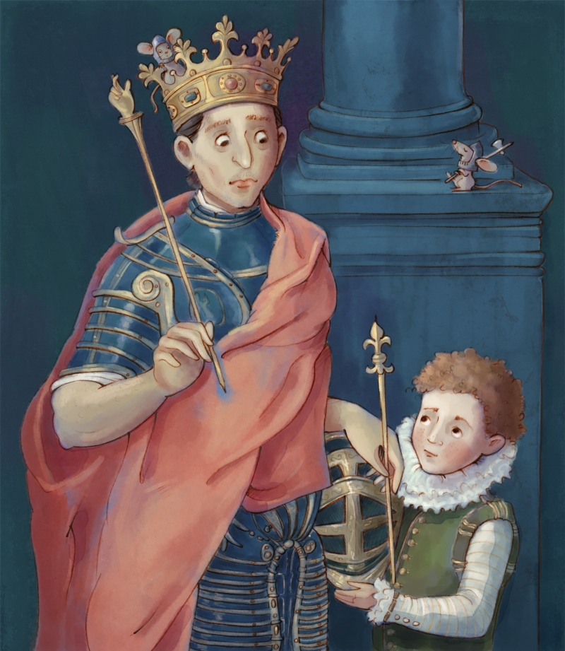
My Changes:
Added characterization to the characters, simplified the background, and altered the colors. Their faces are also wider than in the original.
Things I thought/Questions I asked:
What I really want to know is who this page is?!! How long has he been working for the king? What is he thinking? What is he examining? What are his duties? How old is he? Does he enjoy his job? What about his family? Does he get to see them? Does he have any friends? Is the king kind to him? Does he look up to the king?
I also want to know why the king is holding a pointer finger? I assume it symbolizes his faith in God, but it feels somewhat comedic and out of place. While walking by, my son thought that the king looked so bored, and that there should be a thought bubble saying, ‘‘I’m not getting paid enough for this!’’ I’m also pretty sure that that suit of armor isn’t comfortable, and is probably sweat-inducing!
What I noticed or learned from El Greco’s techniques:
If you are familiar with El Greco, you might not immediately think El Greco at first glance. It is significantly less stylized than his traditionally long, skinny, somewhat distorted people and unique color palettes. But the more I worked on it the more I recognized some of his later stylistic choices—especially in the page’s really long neck. Some of El Greco’s background color choices also have a touch of what he’s known for.
While researching which El Greco painting to use for MousterWorks, I considered A Boy Lighting a Candle. I worried that St. Louis, King of France, and a Page hinted to being more of a portrait than an insight to life, but I was so intrigued by the page and the juxtaposition between him and the king that it won the coin toss.
What I appreciated most about this piece (besides the page) is, as always, in the details: the circles around St. Louis’s eyes and all of the scratches and variations in his suit of armor. There’s a lot to look at and wonder about!

My Changes:
If you are familiar with the original, you know I changed a lot—and not only the color palette! To start, I made St. Margaret younger and the dragon less menacing. I also added a friendlier storyline of Margaret as princess to the castle in the background. And since it looks like something is burning in the background, I decided the dragon had gone there to raid all her treats!
This one was a challenge for me. Because I changed Titian’s underlying story, I felt the need to alter the color palette to better fit the subject matter. I wanted to preserve Titian’s element of dramatic lighting, but didn’t want it to feel too dark. Since I admire artists who can create effective night scenes with saturated blues, greens, and purples I played around with that—but then it felt a little too colorful so I pushed and pulled with the saturation balance. Hopefully I’ve succeeded? If nothing else, I learned that dark scenes need an especially strong value structure to achieve the affect without feeling overbearing—and that breathing room for the eyes to rest helps strike the right balance.
Things I thought/Questions I asked:
I was frustrated that I couldn’t see the details in this painting—but of course, that’s part of Titian’s style and legacy. It was hard to figure out the dragon’s anatomy and the background elements, so I did some extra decision-making and research (I don’t draw a lot of dragons and castles!). Perhaps I could have incorporated more of Titian’s painterly brushstrokes, but that would have defeated my goal of turning this into something of my own.
What I noticed or learned from Titian’s techniques:
I wonder if this is one of the first Damsel in Distress paintings? Titian masterfully ensures that St. Margaret is what we see first and foremost. Her form and anatomy are impeccable. It took some time for me to find the dragon, however, which blends almost completely into the background. I wondered why Titian opted to create a more docile dragon. It almost doesn’t match Margaret’s fearful demeanor (which is understandable, given those massive claws). But I wonder why he chose to make it sleepy instead of ferocious?
All of the previous painters in this series used more realistically detailed backgrounds. My research shows that Titian was one of the premier painters who worked his brush strokes more expressively (hence why I couldn’t zoom in to see everything!). I also read that he was masterful at portraying the ‘‘real character of his models’’—which I would agree with, given Margaret’s expression and body language. I also appreciate Titian’s drama and the subtle light reflections he gives key elements (like the dragon‘s claws). Some painters—myself included—have the temptation to highlight everything, while he was selective about what gets highlights and what doesn’t.

When I was little, Mom and I often looked through a beautiful book of Masterpieces. I asked lots of questions about these people painted in time: How were we the same? How were we different? If you are also a fan of masterpieces, children’s book art, and searching for mice, I invite you to follow along!
All original images © Angela C. Hawkins


Love a MousterWork print? They will be available in my Etsy shop. Don’t see the one you want? Email me and I’ll add it in.

